UX Engineering for High-Complexity Dashboard Systems
How to design and build interfaces that make massive datasets and complex workflows feel intuitive and responsive.
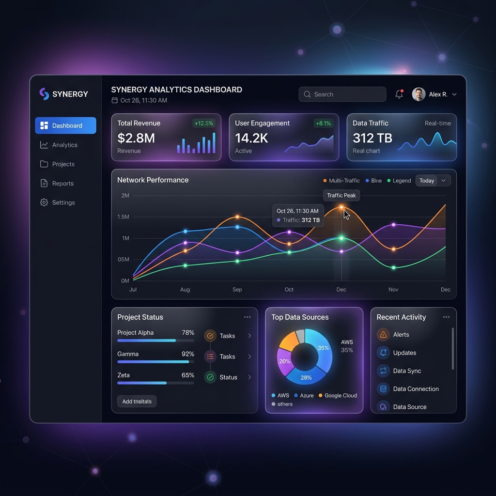
Engineering complex dashboards requires a deep understanding of information density and user intent. As products scale, they often collect massive amounts of data. The challenge is transforming this raw data into actionable insights without overwhelming the user. 'UX Engineering' is the bridge between aesthetic design and technical feasibility.
We start with the principle of 'Progressive Disclosure'. Users shouldn't see everything at once. We design interfaces that provide a high-level overview with the ability to dive into details on demand. This keeps the initial landing page clean and focused, reducing the cognitive load on the user.
Performance is a critical component of UX in dashboard systems. A dashboard that takes five seconds to load data is a dashboard that users will avoid. We implement advanced data fetching strategies like 'Windowing' or 'Virtual Scrolling' for massive tables, ensuring that we only render what is visible on the screen.
Real-time updates are often required for high-stakes dashboards—think fintech or network monitoring. We use WebSockets and optimized state management to stream data live to the interface. The key is to manage these updates without causing the entire UI to re-render, which would lead to a jittery and unresponsive user experience.
Accessibility (a11y) is a core requirement, not an optional extra. Complex data visualizations must be accessible to users with visual impairments. We use semantic HTML, ARIA labels, and ensure that our color palettes for data charts have sufficient contrast. We also provide keyboard-accessible alternatives to interactive data elements.
Customization is the final tier of a great dashboard. Different users have different needs. We build modular 'Component Libraries' that allow users to rearrange, resize, and hide widgets based on their specific goals. This turns the dashboard into a personalized workspace, increasing its value to the enterprise.
Data visualization is more than just pretty charts. We choose the right type of visualization for the data—using sparklines for trends, heatmaps for geographic data, and Sankey diagrams for flow analysis. We avoid 'chart junk' and focus on maximum clarity, ensuring that a user can understand the state of their system in a single glance.
Design systems are the foundation of consistency. For high-complexity applications, we build a dedicated Design System in Figma which is mirrored by a React component library. This ensures that every button, chart, and layout feels part of a cohesive whole, reducing the learning curve for the user as the application expands.
Responsive design for dashboards requires a unique approach. We don't just 'stack' components on mobile; we identify the most critical 'on-the-go' metrics and prioritize them, while providing a simplified interface for mobile users. This ensures that the platform remains useful regardless of the device being used.
In conclusion, UX Engineering for complexity is about managing data, performance, and user psychology simultaneously. By focusing on these areas, we build tools that empower users to manage massive systems with confidence and ease.